Homes can end up with “Trim White” by default, even though it might be too bright, too blue, or just too much in the space.
Trim Deserves More Thought Than “Just White”
Defaulting to bright white trim may seem safe, but it often clashes with surrounding tones and materials.
Trim color is often chosen last—or not at all. Many homes end up with “trim white” by default, even though it might be too bright, too blue, or just too much in the space.
The goal isn’t to make the trim jump out—it’s to make it fit with the other elements in the room, especially wall color and fixed surfaces like floors.
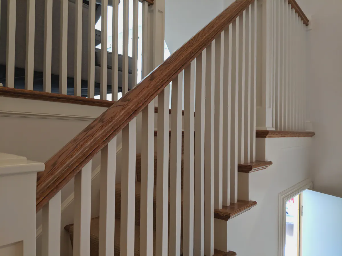
Trim as a Supporting Player
Trim should frame and enhance a room, not steal the spotlight.
For every traditional design trend, there are six designers championing something unconventional. And that’s fine—as long as it’s intentional.
When chosen well, trim provides visual structure to a room without drawing too much attention to itself. It’s like the outline on a drawing—meant to define the form, not become the focus.
Of course, not all trim choices are meant to be subtle. Take this example:
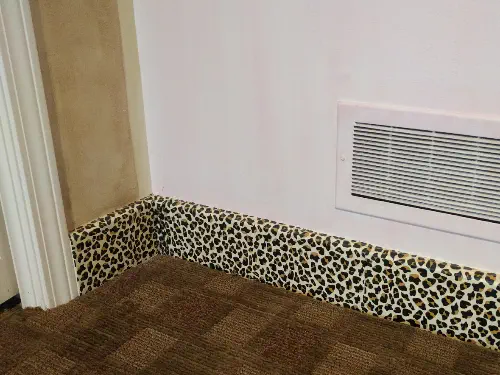
This leopard-pattern baseboard certainly does steal the show. And while it's not for everyone, it’s a reminder that there are exceptions to every rule.
Let the Floors Help Guide the Choice
Fixed elements like flooring and stonework can help narrow down the right shade of white or off-white.
Before you think about walls or trim, take a look down. Floors—especially wood tones, tile, or natural stone—often have strong undertones that should be part of the color equation.
If your floors are warm, a creamy or soft beige-white might work best. For cooler tones like slate or gray-washed wood, a crisp neutral or soft gray-white might feel more in sync.
Wall Color Comes First
Once you’ve picked the wall color, you’ll have a clearer path to choosing the right trim.
Trim is, by design, secondary. Its job is to support the main event—which is usually the wall color. That’s why we always recommend deciding on the wall color before locking in trim options.
If the wall color is rich and deep, a high-contrast trim might feel dramatic. If the wall color is soft and muted, a matching off-white can create a peaceful look.
It’s All About Undertones
The right trim color supports the wall—cool whites for cool colors, warm whites for warm tones.
Even neutral paint colors carry undertones. A beige might lean pink or yellow, a gray might lean blue or green. Matching those undertones in the trim helps everything feel cohesive.
Pure white paint rarely reads as truly neutral. Often, it makes everything else in the room look off. That’s why using the right white—based on undertone—is so important.
How Much Contrast is Comfortable?
Some prefer crisp outlines; others want a softer blend. It’s a matter of preference and room use.
A high-contrast white trim can create a clean, graphic edge between wall and ceiling. But not everyone loves that look. In some rooms—like bedrooms or living areas—a softer contrast feels more restful.
In historic homes, a lower-contrast approach often fits better with the architectural details and flow. In more modern interiors, crisp trim lines can feel fresh and structured.
One Color, Two Sheens
Painting walls and trim the same color—just in different finishes—can make a small room feel calmer and larger.
This trick works especially well in rooms with a lot of visual interruptions: windows, doors, cabinetry, built-ins. Instead of outlining every edge, a single color in both matte and semi-gloss gives a quiet, unified look.
It also helps reduce the “busy” effect that too much trim contrast can create—especially in smaller or oddly shaped spaces.
Subtle Trim Choices Add to Resale Value
Tasteful trim colors improve livability and visual flow—and help homes show better on the market.
Trim that works with the rest of the home—rather than jumping out—usually appeals to more buyers. It’s not about playing it safe, but about creating a cohesive feel that doesn’t age too quickly.
That’s why thoughtful trim is worth the effort. It’s a finishing touch that pays off both in everyday comfort and resale value.
If you’re already planning other updates, be sure to dispose of old paint the right way. And if warranties are a concern, our post on what’s a warranty worth might be helpful as well.
Book a Quick Estimate
Need help selecting the right trim colors? We can walk through the options together. Just book an estimate using our simple online form—most meetings take under 30 minutes, and we’ll leave you with a clear plan and zero pressure.

Latest Posts

How to Prepare for Professional Painters
02 Jan, 2026
Interior vs Exterior Paint: What’s the Difference?
02 Jan, 2026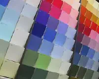
How to Test Paint Colors
20 Apr, 2025
Essential Elements of a Painting Agreement
22 Oct, 2023