Peel 'n Stick color samples have changed everything - they're cheap, easy and moveable, leaving messy and unreliable color samples way behind.
Why Color Testing Matters
Paint color is one of the most visible decisions you’ll make—but tiny fan deck samples and color swatches from the paint store rarely tell the full story. Those printed squares are made with ink, not paint, and they’re often viewed under fluorescent lights.
Colors look dramatically different once they’re on a larger surface and exposed to natural and artificial light in your home. A small mistake in tone, undertone, or intensity can affect the entire room—or the whole house.
Understanding How Light Affects Color
Colors shift dramatically depending on lighting type, time of day, and even direction of exposure.
A color that feels cozy in the evening might look washed out by morning.
Natural light tends to reveal a color’s undertone more clearly, while warm incandescent bulbs can make colors feel cozier—or muddy. LED lighting might sharpen cool tones or intensify brightness.
Time of day plays a role, too. Morning light is cooler, midday light is neutral, and evening light adds warmth. If your test color only looks good at one time of day, it might not be the best long-term fit.
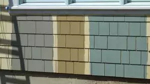
Start with Peel-and-Stick Samples
These removable swatches are clean, easy to reposition, and show how color responds to real light in your space.
Peel-and-stick samples from companies like Samplize or major paint manufacturers are a great first step. They’re made with actual paint—not ink—and stick flat to your wall without damaging it.
Move them around your room to see how the same color shifts in corners, near windows, or under artificial light. You’ll often find that one color reads differently in multiple spots.
Try Online Color Tools and Visualizers
Virtual tools from major paint brands can help narrow your options before you test in person.
If you’re overwhelmed by choices, online visualizers can help you get started. Sherwin-Williams’ ColorSnap Visualizer, Benjamin Moore’s Personal Color Viewer, and others let you upload a photo and “paint” your space digitally.
While they won’t replace real-world testing, they’re a good way to see if you’re leaning warm or cool—or if that bold color you love might be better as an accent.
When to Use Paint Samples on the Wall
If you're still deciding, sample paint can help—but apply it right: two coats, larger than you think, with space between colors.
Use Two Coats
Always apply two coats to get a true sense of color and coverage. Many paints change subtly between the first and second coat, especially darker or high-sheen finishes.
Leave Space Between Colors
If you’re testing multiple options, leave a clear border between them. Colors placed too close together can distort your perception—one may appear warmer or cooler depending on what’s next to it.
Don’t Rush the Process
Give yourself time to observe color over several days to avoid surprises and second-guessing.
Colors don’t just change with lighting—they change with mood, furniture, and time of day. That warm gray you liked yesterday might feel too beige today, or too blue next week.
Give yourself time to live with a color before you live in it.
Let your samples sit for a few days and check them in the morning, afternoon, and evening. Pay attention to how they look under task lighting and next to nearby colors like tile, countertops, or trim. It’s a small investment of time that saves a lot of regret.
Ready to Move Forward?
Once you’ve found the right color, we can help bring it to life. You can book an estimate online at a time that works best for you—usually a quick, no-pressure meeting that takes less than 30 minutes.
For more inspiration, check out our colors interior gallery, read our guide on painting kitchen cabinets , or explore why touch-up paint isn’t always as easy as it seems.

Latest Posts


How to Prepare for Professional Painters
02 Jan, 2026
Interior vs Exterior Paint: What’s the Difference?
02 Jan, 2026
Essential Elements of a Painting Agreement
22 Oct, 2023