What Color Should I Paint My House?
Choosing Exterior Colors
Picking an exterior paint color can feel like a big decision, but with the right resources and a little guidance, you’ll find a color you love that enhances your home’s style and curb appeal. Down below there are hints for Exterior and Interior colors, too.
Color Resources
Not sure where to start? Here are some resources that can help you explore options and find the perfect shade for your home.
Wall of Chips – Don’t
It’s tempting to head straight to the paint store and stare at the wall of endless color chips, hoping the perfect shade will jump out at you. Spoiler alert: it won’t. The sheer number of choices can be overwhelming, and colors rarely look the same on your home as they do under store lighting. Instead, start with a plan—consider your home’s architecture, surroundings, and existing elements like brick, stone, or roofing. We’ll guide you toward helpful tools and resources that make selecting a color easier and more successful.
Online Colorizer Tools – Helpful, But Finicky
Sherwin Williams and Benjamin Moore both offer online color selection tools that let you upload a photo of your home and test different colors. Sounds great, right? In theory, yes. In practice, expect to spend a good chunk of time uploading photos and fiddling with color placements. They’re a useful tool for narrowing down options, but they require patience.
Peel-And-Stick Options – Easier is Better
Small paint chips don’t give you the full picture when choosing an exterior color. Peel-and-stick samples from paint manufacturers and Samplize offer a better way to see how colors compare against existing materials. These letter-sized swatches can be moved and viewed in different light, making them a simple way to test colors before committing.
It's one thing to miss by just a bit on your living room color, quite another make that same mistake on an entire exterior.
Online Color Consultants – Expert Help at Your Fingertips
If you’d rather skip the guesswork, online consultants offer color guidance tailored to your home. Send photos, tell them you like Blue but not Red (or whatever), mid-century or traditional, etc. Costs vary as do the deliverables - some homeowners find that a color rendering is especially helpful.
Local Color Consultants – Being There
For a more personalized experience, local color consultants usually meet on-site, taking into account lighting, architecture, roof and brick color and surrounding elements. This can help ensure the final color choice complements your home beautifully and seamlessly. Be sure to ask about meeting length, renderings, etc.
Exterior Color Hints
After years of helping hundreds of Kansas City homeowners navigate exterior color choices, we’ve learned what helps to create a cohesive look that enhances your home’s character and curb appeal. These tried-and-true hints will help you make a decision you’ll love for years to come.
Objective: “That’s My House, It’s Flippin’ Awesome!”
A great exterior paint job should do more than just freshen up your home—it should make you proud every time you pull into the driveway. The right color combination highlights your home’s best features, creates a welcoming presence, and feels uniquely you.

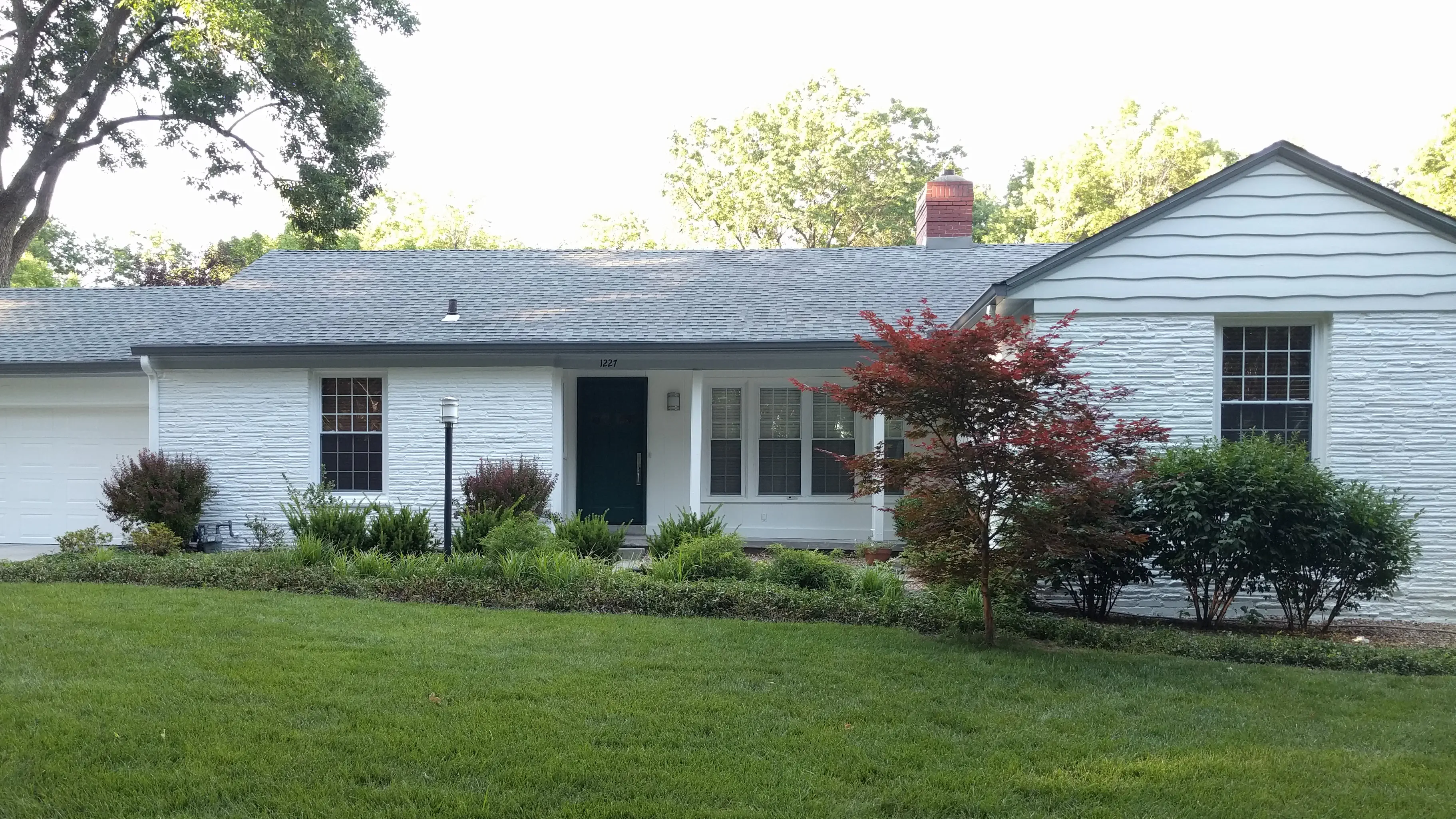
Light Colors Look Whiter
Lighter paint colors often appear even brighter once applied, especially in full sunlight. A soft off-white or light gray on a paint chip can look stark white on an entire house, so testing samples in natural light is key to avoiding surprises.
They provided sound advice on how to make sure the trim, background and gutter colors worked together. We highly recommend them.
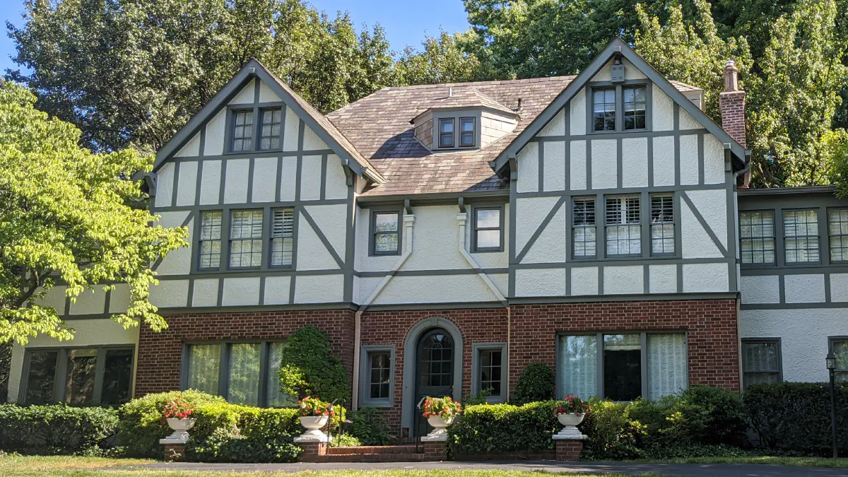
Shutters: Keep or Remove?
Shutters can add charm and definition, but not every home needs them. If they’re too small, improperly placed, or purely decorative, removing them can create a cleaner, more modern look. Maybe yesterday's "excuse for some color" is best removed.
Brick – Natural Limewash?
Coloring brick - whether natural limewash or paint - can transform and refresh an aging exterior. But it’s also a permanent decision that requires careful prep and the right products to ensure a lasting finish.
White Windows PLUS White Trim?
Pairing white windows with white trim might seem like a safe choice, but it can sometimes leave a home looking overpowered with white squares. Adding subtle contrast with a slightly darker trim color (linen-ish) can help define architectural features and add some dimension.
Matchy-Matchy or Definition?
Too much of the same color can make a home blend into the background. Thoughtful contrast — whether in trim, shutters, or accents — adds depth and highlights architectural details, making the exterior more visually interesting and inviting.
A Little Contrast is Good
Soft, balanced contrast can enhance a home's character without feeling too stark or overwhelming. Harsh contrasts can be bold and dramatic, but they might not be for everyone. Finding the right balance ensures a fresh, intentional look that feels just right.
There were 6 different colors and three different sheens of paint to be used and lot of detail in painting the wood paneling in the living room.
Front Door – Recessed (Hole) or Bright Start?
A recessed front door can disappear into the shadows, making a home feel less inviting. And a dark door color magnifies this effect. A bold, well-chosen front door color adds warmth and personality, creating a welcoming focal point that draws the eye.
Black and White
- Black is not a color - it is the absence of color
- White is the combination of all colors
Garage Door - Statement?
A garage door is not the place to make a color statement unless your garage door is a true architectural feature. Consider going with the body color of the house so that the large chunk of garage door color doesn't call too much attention to itself.
Interior Color Hints
Choosing an interior color is about more than just picking a favorite shade — it’s about finding a color combination that reflects your vision and still works with the natural light, finishes, and architectural features of your home. Here are a few key factors to consider:
Sheen – Surface Texture Matters
The right sheen can enhance or emphasize a surface, especially under critical lighting conditions. Flat and matte finishes help hide minor imperfections, while satin and semi-gloss highlight texture and detail, which can be great — or not so great—depending on the condition of your walls.
Natural Light
Sunlight shifts throughout the day, changing how paint colors appear. A soft gray in the morning might look cooler in the afternoon and warmer at night. Always test colors in different lighting conditions before making a final decision. This is a great use of peel n' stick color samples.
Floor Color
Your walls don’t exist in a vacuum—flooring plays a big role in how a color reads. Dark wood or tile can make lighter walls pop, while neutral flooring allows for bolder wall colors without overwhelming the space.
Fireplace Color
Fireplaces naturally draw attention, but if the original materials feel outdated (hello, 1970s brick!), a fresh color can work wonders. The goal is to enhance — not overpower — the rest of the room. Whether it’s brick, stone, or painted wood, coordinating your fireplace color with your walls creates a seamless, intentional look that ties the space together.